Transforming a LEGO Set to Minifigure Habitats with a Little Disney Magic
As a fan of classic Disney - and one who loves Sorcerer Mickey - 21352 Magic of Disney should be a shoo-in of a set for me. But, I have to admit: the set isn’t knocking it out of the park at first glance for me. But when you consider certain stand-out elements, the price point, and incredible value given how much is included in the set, are these aspects enough to change my initial impression of the Magic of Disney?
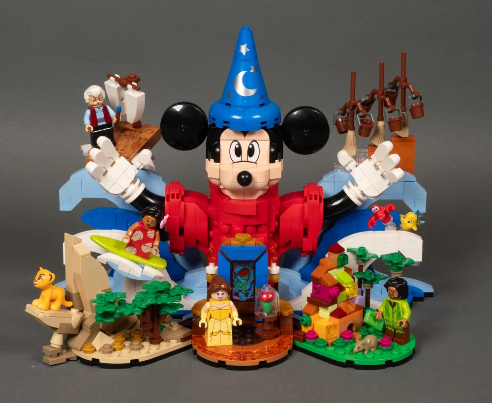
One of the stand-out features of the set is the minifigure selection. I can see the figures being a major selling point for this set amongst minifigure and Disney fans alike. I absolutely love that LEGO included some secondary characters that are much beloved by fans that complement previously released minifigures. Lilo, for example, complements either version of Stitch that was previously released. We also now have Gepetto to pair with Pinocchio (and Cleo the goldfish).
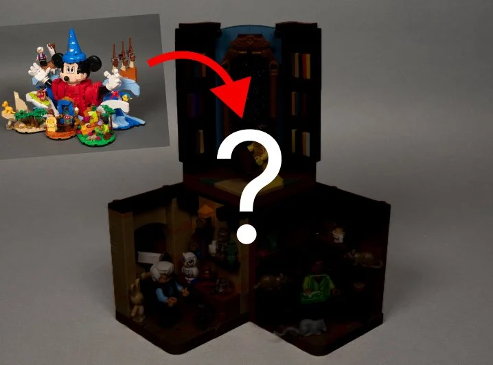
Custom habitats inspired by the set revealed further down!
Given this is a BrickNerd article, I’m not here to simply give you a run-of-the-mill overview of the set that others do so well. The excellent minifigure selection (which I’ll go over in more detail shortly) was the inspiration for building some custom minifigure habitats.
For those who know me as BrickBuiltJosh and my previous minifigure habitat articles, you’ll know I’m known for building detailed habitats focusing on Disney characters. So what’s a more perfect way to celebrate this set as a builder than to have the new Disney minifigures inspire new minifigure habitats!
If the term ‘habitat’ is Greek to you, go ahead and brush up on my previous articles like this one and this one to get an idea of what they are and how you can build them.
We’ll go over 21352 Magic of Disney, highlighting what stands out, good and bad, and then we’ll jump into the MOCs, and provide some insight into the build process.
Building the Magic of Disney
When looking at any set, I think it’s important to put the value and scale of the product into context. I’m not sure who’s to thank, LEGO or Disney, for the value delivered in this set. Let’s start with the pro of 21352, which is an adult-centered display piece for under $100 USD. That’s already a step in the right direction when so many adult sets’ prices are often astronomical.
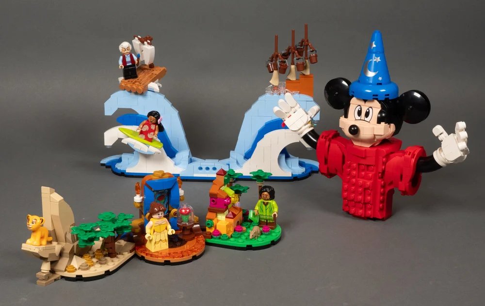
The set is built with three major sections. The waves and the front scenes connect together. Mickey rests in the waves, cradled there instead of secured in place.
Next, let’s look at the value in what is a $99.99 USD price point for a 1,103-piece adult-oriented set. Consider that the set offers four exclusive minifigures - including an exclusive animal, Simba. On top of the minifigures, the set has no stickers, only printed pieces, including the magic hat and an exceptional printed window. And knowing that it’s Disney we’re talking about here, which is notorious for its “IP tax,” this adds up to some amazing value and seems like Disney’s love letter to itself.
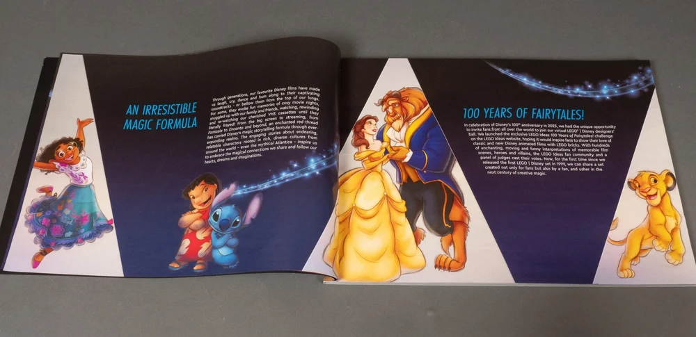
Context matters, and considering what set designers have to work with to make a set helps to understand certain design limitations or choices made.
If you’re not aware, 21352 started as a submission from a LEGO Ideas contest. Magic of Disney is based on a fan submission from Anna Chen (2A2A on the platform). The designers made a lot of changes to turn her work into an official set. There are many improvements to Anna’s original design, but compromises were made in order to be a more compact set.
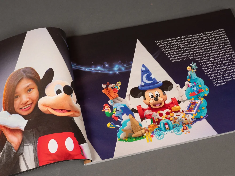
Fan Designer and original submission, which honestly would have been a bigger set if they built Mickey at the same scale, and a costlier set
Context Meets Compromise: Where Magic of Disney Falls a Bit Short
The effort on the part of the designers to keep the Magic of Disney compact and remain in the $100 price point are the cause for the only real problems I have with the set: the overall visual composition of the build and the design of Mickey’s head.
View fullsize
View fullsize

View fullsize
View fullsize

View fullsize

View fullsize

Regarding the composition of the set, it really comes down to the many disparate elements, that become a bit of a visual mess around Mickey, the anchor that helps provide a point of focus to the overall build. The smaller scenes in the build blend together with too many different shapes and colors and competing details to feel cohesive and visually organized. Not devestatingly so, but enough to detract from the visual impact it could have had.
But, having so many little details spanning decades of Disney magic could be the very thing that makes it enchanting for you.
The Mixed Bag of Mickey’s Head
The other major point of criticism for me is the shape of Mickey’s head. I could nitpick the weird look of the robes around his body compared to the more interesting sleeves, but the robes are mostly hidden by other details in front of them. The head, however, is what the eye gravitates to. It has a lot of good things going for it, including it being the most interesting part to build, and the proportions compared to the buildable Mickey Mouse in set 43179 look much better overall. Considering the iconic shape of the mouse is burned into our popular consciousness, it’s honestly hard to get it perfect.
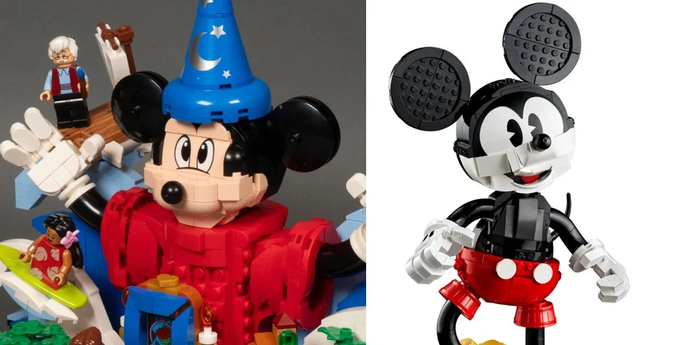
The most offsetting part of the build is the lack of a mouth. The original fan submission had a great, open smiling mouth. This Mickey has no mouth at all. The area where the mouth is reminiscent of horror films where a character’s mouth disappears is instead replaced with smooth skin. The lack of a real mouth also takes away much of Mickey’s personality.
But, as I mentioned, the head was also one of the most interesting parts to build. In fact, all of Mickey was. Most of the build process for this set was very straightforward if not a little boring. That is, until the end of the build, you get to build Mickey Mouse himself. Most of it is nothing groundbreaking, but it had many areas of interesting SNOT construction and a few interesting parts usages that made it a lot more fun than the rest of the set, particularly at the very end when you do the head.
In a way, it’s an interesting way to leave the builder with a better impression of the build experience, as the end of an experience is what leaves the greatest impression on us psychologically through the “recency effect.” The shaping of Mickey’s head in such a compact form, going in pretty much all directions with a tight SNOT core was fun to see come together.
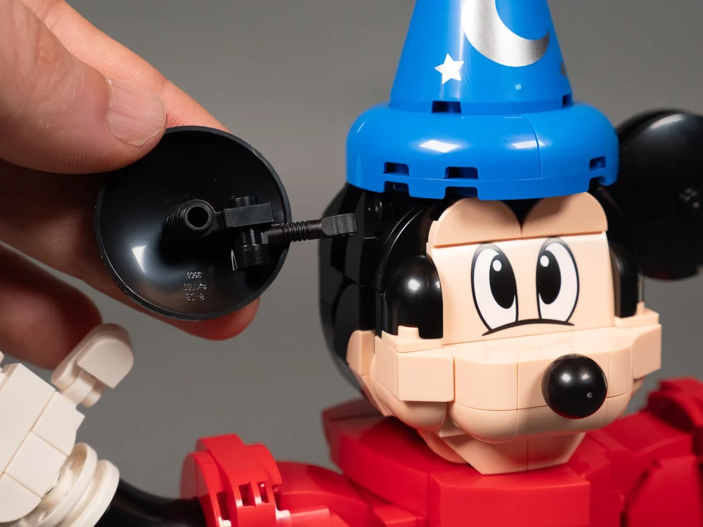
The ears in particular were simple but brilliant, and the dishes for ears are proportional to the head (unlike the aforementioned older buildable Mickey).
The Cast Makes the Movie (or Set)
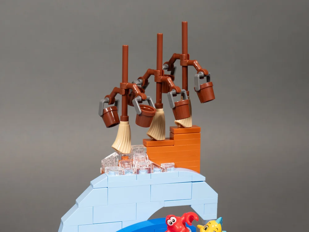
Here’s where the set really shines: the minifigures and animal characters (I would say the magical water-toting brooms are brick-built characters, too). The minifigure and character lineup includes Gepetto, Simba, Bruno, Belle, Sebastian, Flounder and Lilo. All but Founder and Sebastian are exclusive to this set. In a world that all too often keeps recycling the same main characters, I applaud expanding into supporting characters, which only opens the doors to more interesting opportunities to build MOCs.

As a fan of Stitch, I’ve been waiting for Lilo to finally be a figure, and many had hoped she would eventually come to the CMF line. Bruno is spectacular and very welcome, coming with his printed vision plate. And Gipetto really helps compliment the Pinocchio minifigure we already have.
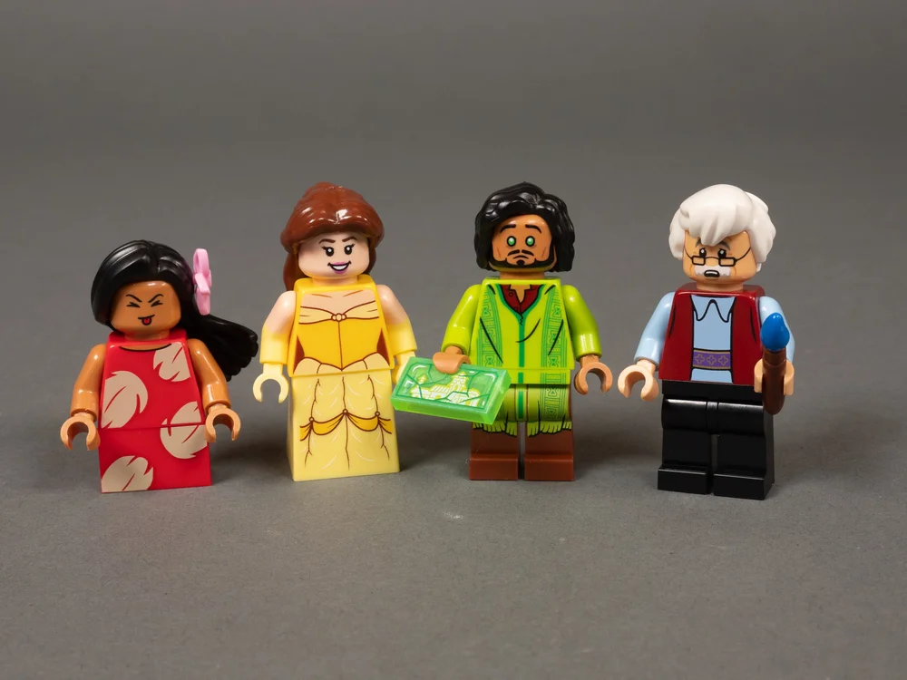
Some Interesting Alternate Faces expressing some emotion or Bruno’s vision eyes. Except Belle who simply smiles bigger.
All the figures have excellent, detailed printing, and dual expressions. Although I do find it interesting that Belle’s two expressions are smiling and smiling bigger. Take from that what you will.
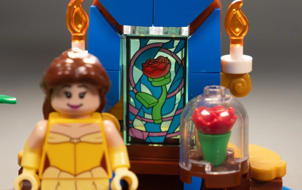
Speaking of Belle, her little scene comes with an incredible printed window piece of the rose in stained glass that really caught my eye when I pulled it out of the paper bag. Another stand-out element of the set is the printed sorcerer’s hat.
The Magic of Disney-Inspired Habitats
This, my friends, is where we go beyond the set to see what it can inspire as a MOC builder. And the minifigures were the place to go from. The truth is, there are not that many interesting parts in the set, but the minifigures are very exciting, and each has its own little scene - so why not go a step further and build out some minifigure habitats?

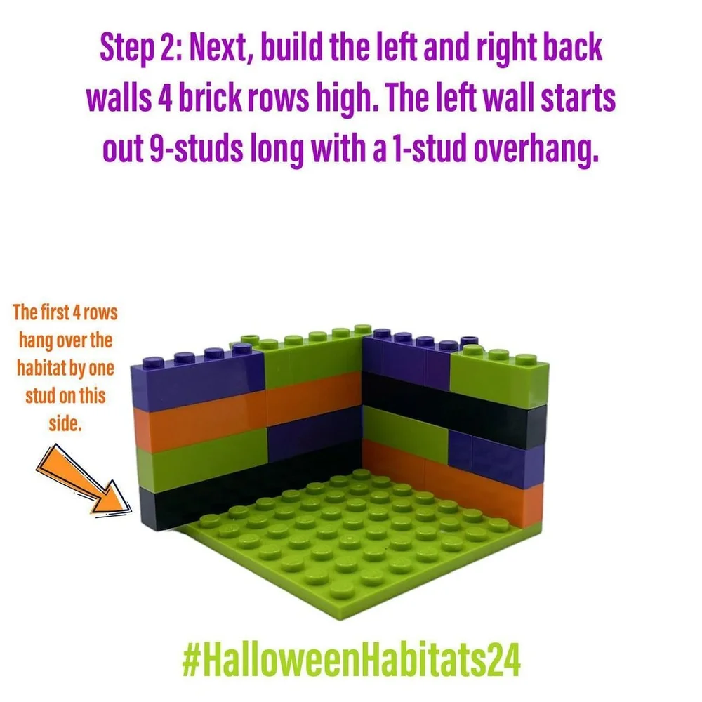

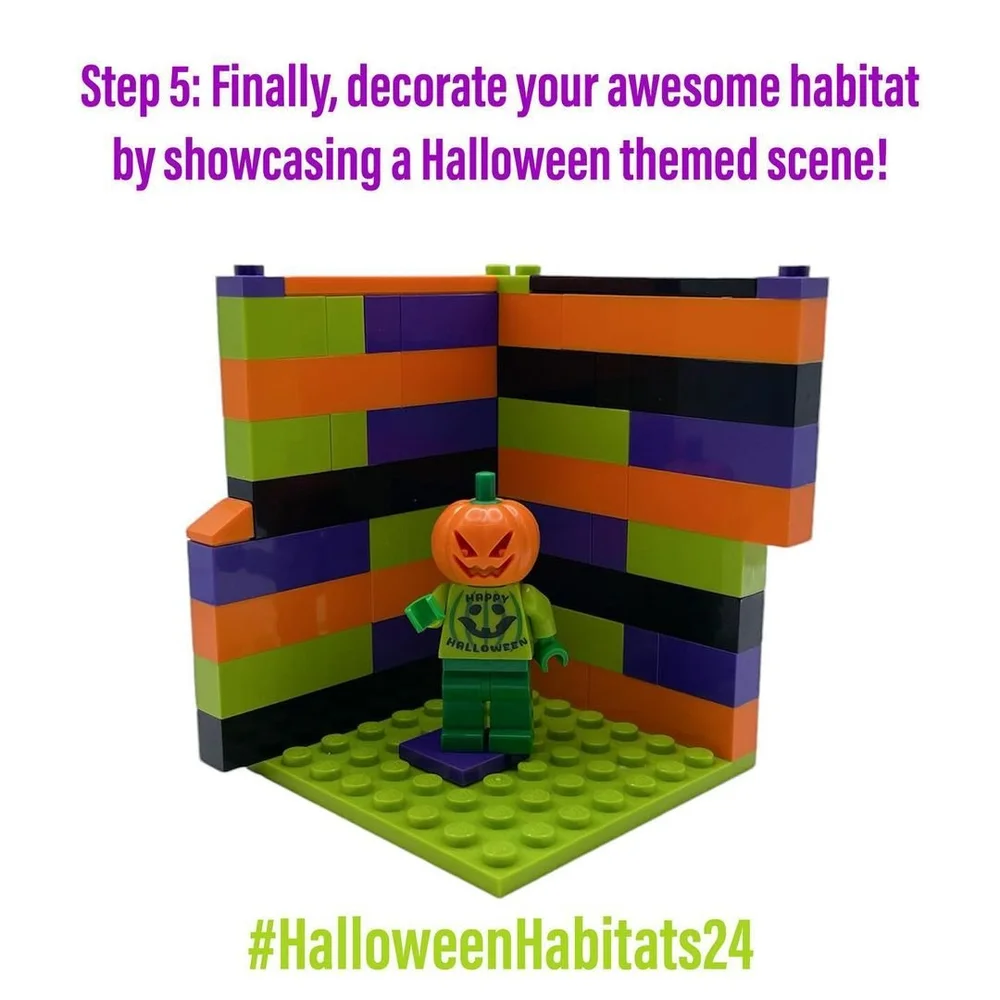


Minifigure habitats are essentially 8-stud by 8-stud builds that are often designed to stack together. I go into detail about how to build habitats and advanced techniques to take it up a level in previous articles. At their core, habitats are corner dioramas featuring a minifigure. There are entire challenges built around habitat building, namely those put on by Jen at the Habitat Challenge Instagram page (a Halloween Habitat Challenge is starting now that you can join!), which is how I got started building habitats.
The first step was to look at the minifigures and dream up what I could do with them as in a habitat. The constraints of an 8x8 habitat with only two walls can limit what’s possible, but it’s also a creative constraint that makes it interesting.
I started with designing a habitat for Gepetto first. I thought about trying to create the inside of Monstro the whale, but ended up moving towards his iconic toyshop where he creates Pinocchio.
Crafting a Craftsman’s Workshop
The first thing I do when designing a habitat based on a movie is look up references. I don’t go super deep, just enough to get an idea of what the key features of a scene are. The truth is, the constraints of habitat, as well as the proportions of LEGO in minifig scale, means you need to make some visual interpretation. You need to get to the essence of things, without it necessarily being an exact replica and let the inspiration take you to what looks interesting within those constraints and proportions.
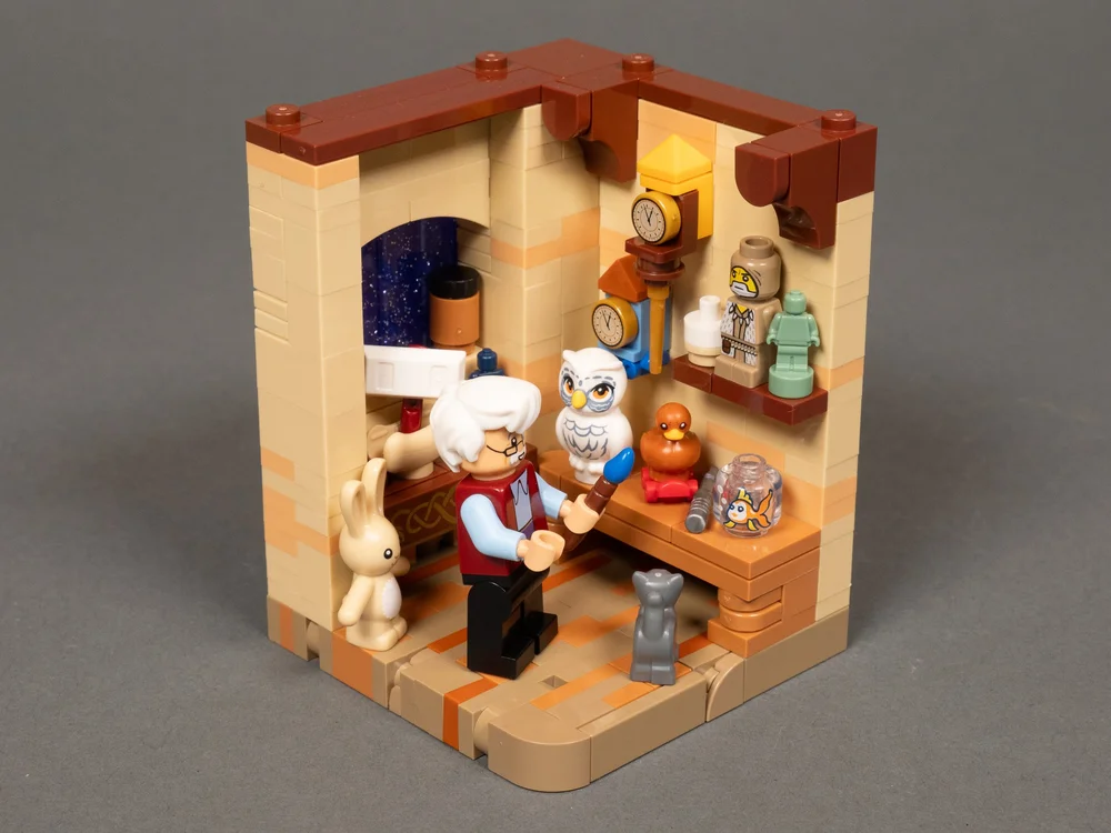
Some of the key things in Gepetto’s workshop are the workbench, the alcove with arched window, the clocks on the wall, and the decorative painting work that was seen in the woodwork of his home.
I then think about key features and ways to make the build interesting, including if there are any interesting techniques or parts I could think up to use in it. I find that it always helps to make more interesting builds, even if it could be done in an easier, more straightforward way. I spent quite a while trying to brick-build toys to put in his shop rather than just use pre-molded LEGO elements.
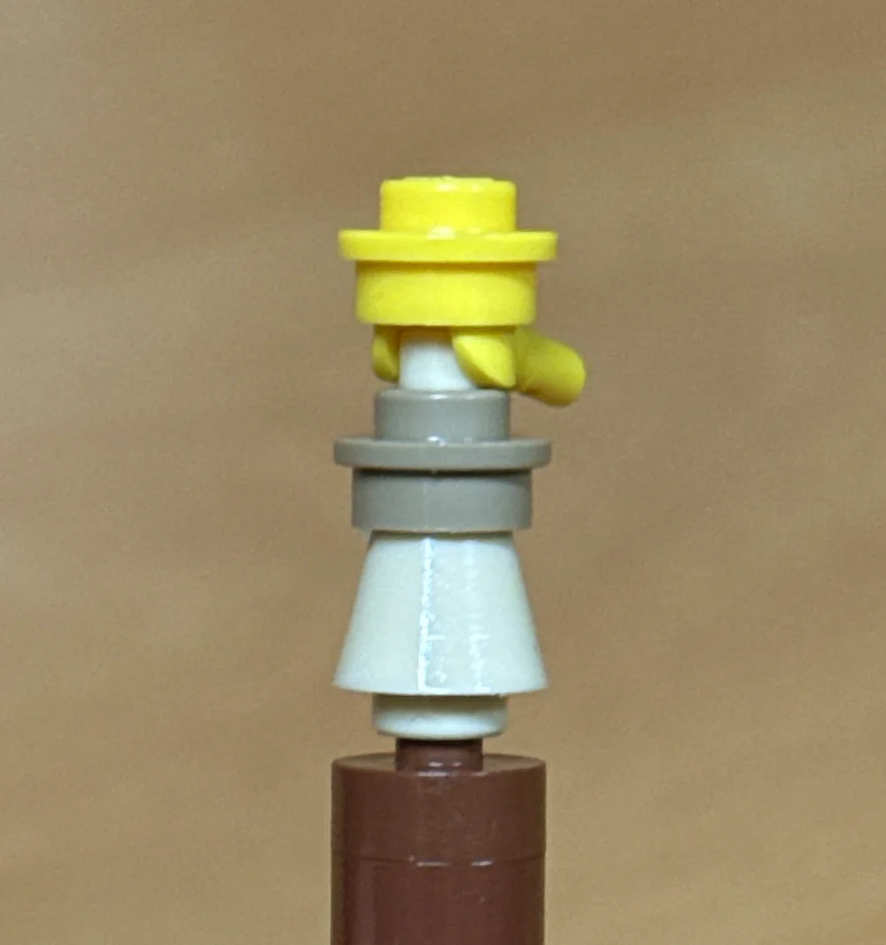
The smallest toy I could brick build a doll with yellow hair that Geppetto is working on. But it was still to tall to fit on the work table! Using a minifigure hand to frame the hair around the face and have a pony tail.
I came up with several brick-built toy ideas, but no matter how small the parts or how few the parts (even using minifigure hands and parts no bigger than 1x1), most of them just didn’t fit in the scale of the habitat.
I was able to include a brick-built Viking ship using a hot dog bun and two interesting cuckoo clocks thanks to a 1x1 printed tile of a clock face. And was able to use some animal elements in a way that looked more like toys than animals.
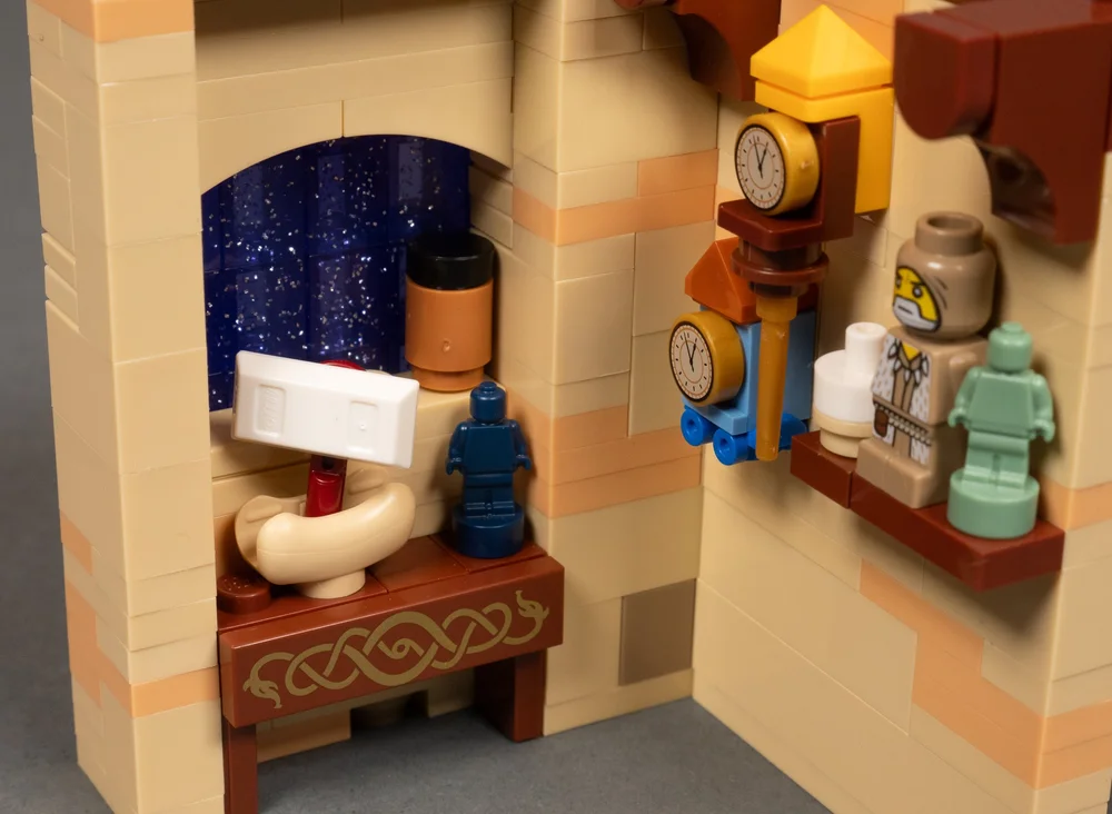
Starry night out the window, hot dog bun viking ship, and cuckoo clocks
Then there was the arched window like the one Jiminy Cricket looks into at the beginning of the movie. I ended up using 1x3 inverted arch bricks (element #70681) turned upside down to get the short arch over the window, and went about finding a way to add it upside down. To get the night effect, I used 1x1 trans-purple with glitter bricks (#6253761) to get that night sky with stars kind of look (and use it to tie in with Belle’s habitat later).
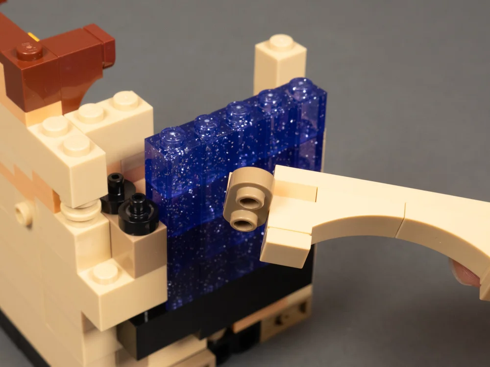
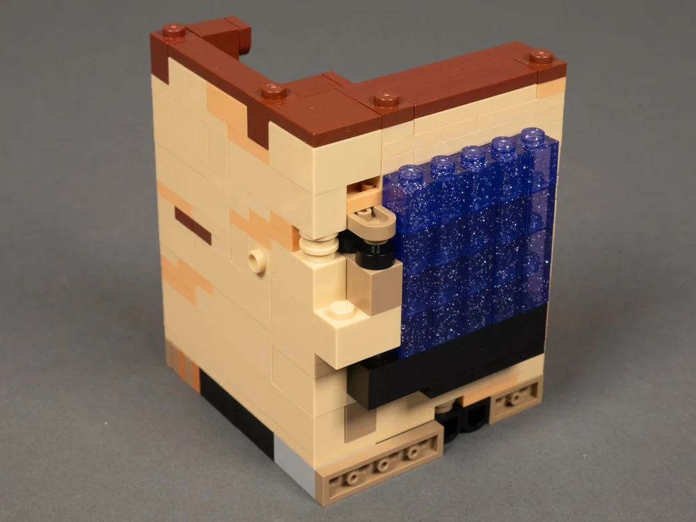
The workbench is fairly simple, but there are interesting little touches in it using 1x1 “D” tiles (#35399). On the tabletop, you’ll see one giving a worn look to the top surface. Then the legs use two stacked on top of each other to add some subtle but interesting detailing for the front of the legs. The second “D” tile is sandwiched in and held by friction and stays in place pretty well.

Normally, habitats start with an 8x8 plate as the base. You may notice that the workshop is done a little differently. I experimented with doing a sideways-built floor for my habitats a little while ago when I was doing my Toy Story integrated habitat stack as a way to better represent the grain in the wood floor of Andy’s room. I loved its effect, not just for the wood grain but for how polished it made the habitat look with a beefier base. (if it’s your first habitat, just go with an 8x8 plate; it’s way easier!I
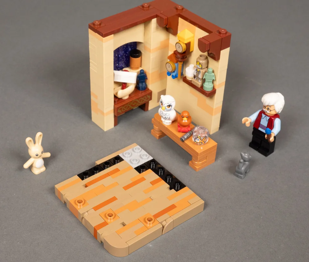
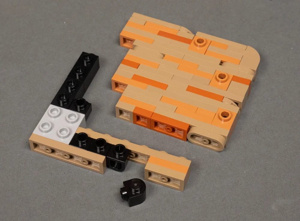
I continued the sideways base build here. A big contributor to being able to do this kind of floor are the new “D” shaped 1x1 swivel SNOT bricks/plates that are 2 plates high (part #3386), which I absolutely love. It’s so versatile for small spaces, and it can even be angled due to the rounded back. In this case, it allows me to create a set of studs flush with the edge of the floor when built sideways like this. Then I use some other SNOT bricks as needed to add studs for the other wall and mounting other items to the floor.
Admittedly, this is more time-intensive, more part-intensive, and trickier to add the floor studs in the right places for mounting other elements in the habitat. But visually, it looks so great. And in this case, I went with adding a curved corner as well, which makes for a clean look that makes the build almost not look like a habitat.
We Don’t Talk About Bruno’s Habitat
With Gepetto’s workshop complete, I moved on to Bruno as the next habitat to build. Bruno is a great character, and I thought about doing something with his visions with swirling sand, but I didn’t really see much detail to include in the scene when I viewed the movie. So I went with his room hidden away in the walls of the Casa Madrigal with his rat friends.

Shhh! We don’t talk about Bruno! But he’s living in the walls of the Madrigal house wth his rat friends.
Again, viewing some references, I found the key things I wanted to capture the essence of - Bruno’s dimpled red armchair, the rats, the walls with bare studs and exposed boards and shelves, and the clutter around him. I wanted to get the funny little rat theater he had in there, but it just wouldn’t work with the tight spacing.
The next step was figuring out techniques, parts, and the ways I could challenge myself. The biggest challenge in this build was the walls. I needed a way to show the raw boarding and wood framing of the house. I felt the best way was to build the wall with the studs facing in so that I could use tiles, including the printed board tiles.
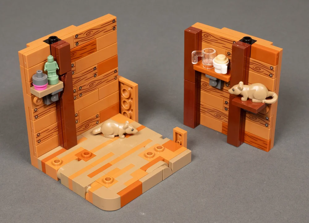
The result was practically building the entire habitat sideways. The wall was built first, figuring out how I was going to do it first before starting to build the floor. Then the floor was built up off that wall with a textured look similar to Gepetto’s workshop to tie them together visually.
The next challenge was how to change direction at the top so studs were facing up again, and how to do the right wall. The 1x1 swivel SNOT double-plate came in handy again here, hidden behind where I placed the vertical framing studs. Then I was able to place the upper wood beam on top. You might also spot a brittle brown broken tile used here for added aging effect and texture!
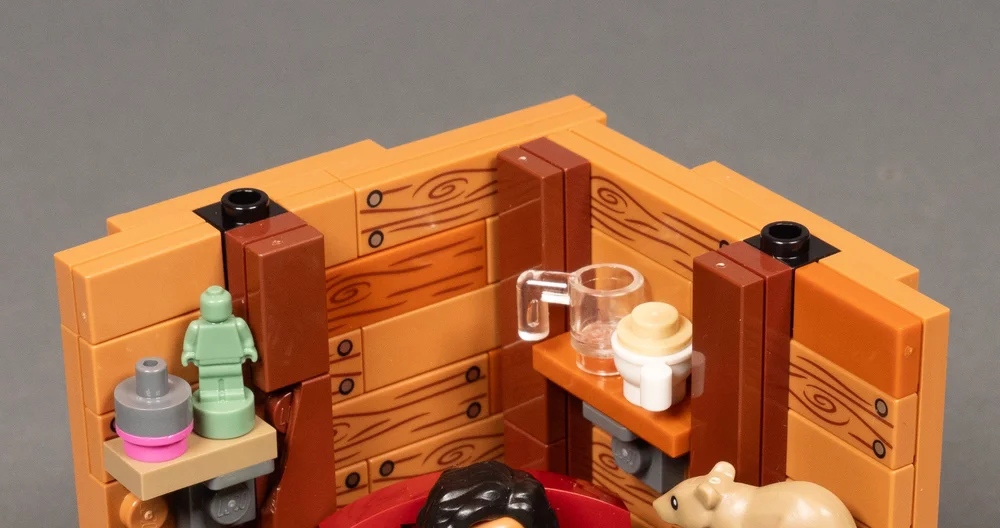
The right wall was more complicated. There was nowhere to attach it to on the edge of the floor or the edge of the left wall. Ultimately, the right wall is attached by only one stud at the top. The top wood beam goes from one wall and connects to the other. It has only one stud connecting the upper beam to the right wall. But I added some plates outside that wall to ensure it stays aligned with the edge of the habitat. It actually worked very well in the end and is pretty stable.
The armchair was a fun little build, using a lot of snot, and the back is hinged using clips and a bar. But to get the back positioned right, I ended up using a couple of 1x2 rounded plates (one of my favorite newer pieces #35480) and stuck clips with a bar end (#3484) into them. Those clips then snapped onto a standard 1x2 plate with bar on the bottom of the chair. I then used brackets, slopes, 1x1 round tiles, and 1x2 round plates to add dimples to the back of the chair while getting the distinctive flared shape.
View fullsize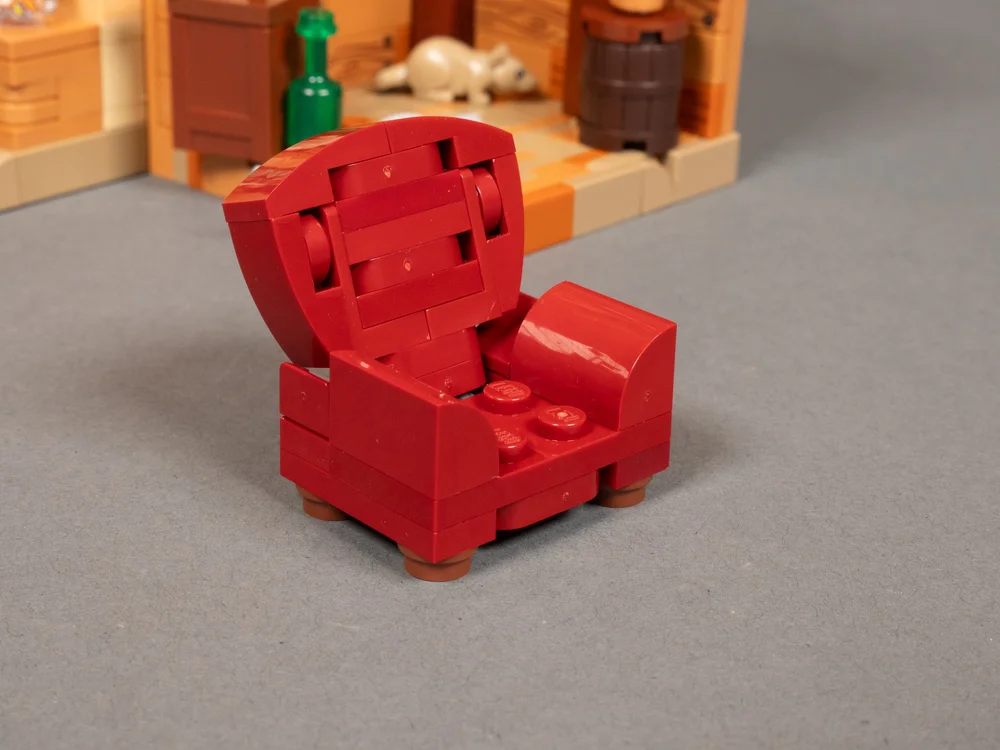
View fullsize

View fullsize

I then added shelves, various accessories, and rats to complete the scene with him in his vision state, holding the vision plate from the movie that Mirabelle put back together.
Ultimately, I wanted a thread that kind of tied these habitats together even though it’s not a truly integrated stack of habitats. Bruno’s workshop pairs well with Gepetto’s workshop, looking like it could be inside Gepetto’s walls in the same way Bruno's room is within the Madrigal house’s walls.
So with the two lower habitats done, it was time to move on to the habitat to go on the top of the stack.
Belle’s Library
The scene for Belle featured in the Magic of Disney is the magic rose room. I’ve already done that room in habitat form with Lumiere, one of my favorites. I had another idea for Belle: the ballroom, one of the most groundbreaking and iconic scenes from the movie. I came up with ways to create gilded, intricate framing with big windows looking out into the snowy or star-filled night.
The build for the ballroom was coming along great until I realized I didn’t have nearly enough of the key part I needed. I needed a lot of the 1x1 trans-purple with glitter bricks I used in Gepetto’s workshop, and it was all going to tie together. Sadly, my dreams came crashing down (for now).
Here’s the thing with MOC building: sometimes you have to work with what you have rather than what you’d like to have. Sometimes you don’t have time for a BrickLink or PAB order. Not being one to be strict about the source material, I brought together the essence of the ballroom into the library and combined them with a new look that could have just as easily been in Beauty and the Beast.
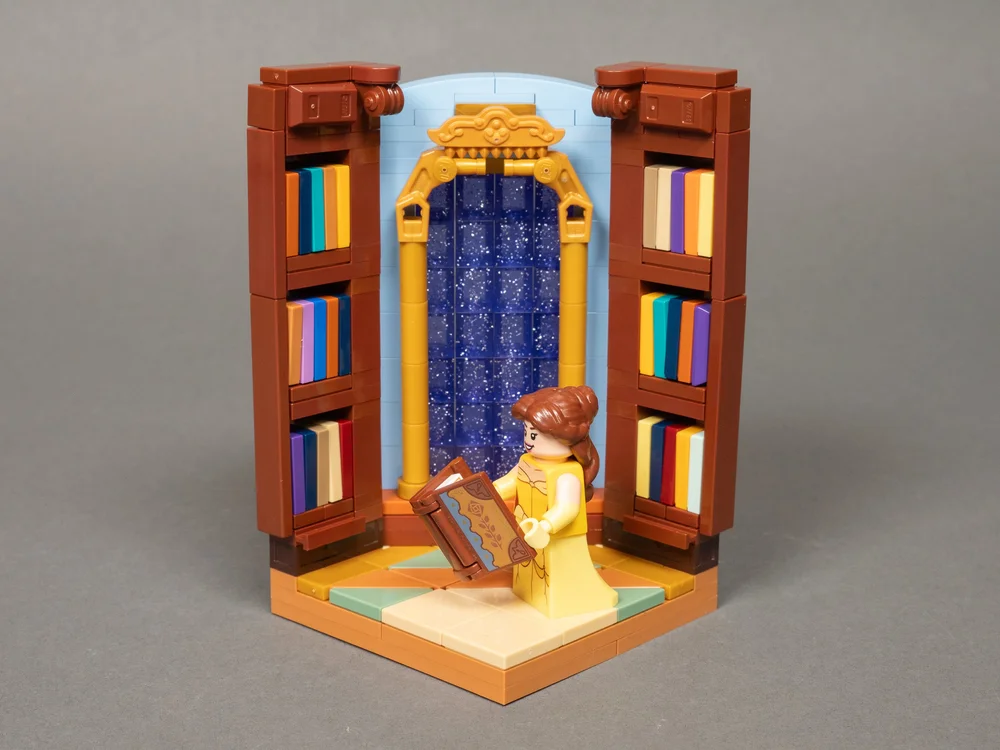
The blend of environments allowed me to combine the work I was doing with the windows, and combine it with some of the essence of the library. I love libraries, so that worked out well anyway, and Belle’s love of books is core to her character. I tried to capture some of the blue walls from reference shots of the library but went with brown shelves instead of blue. Honestly, in this habitat I think having the same blue for the shelves wouldn’t have looked as good in this small habitat anyway. I also needed certain parts to make the bookshelves happen with limited space.
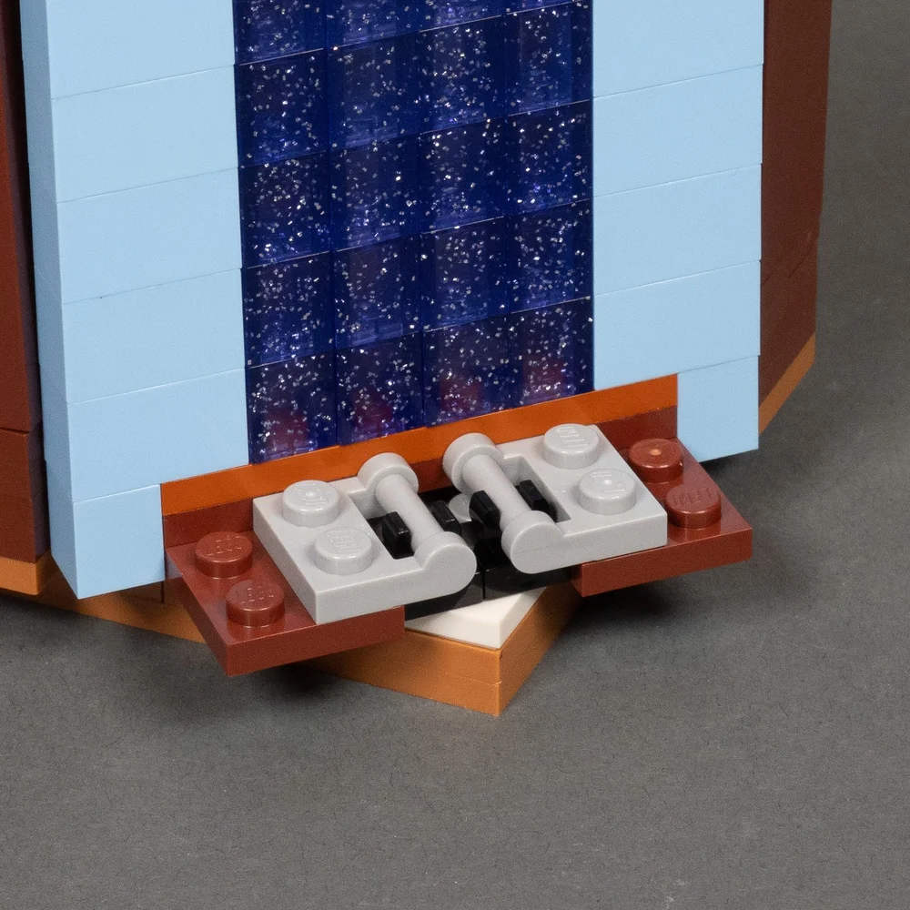
I was originally going to make it easy on myself and put the window on the left wall and the bookshelf on the right, but viewing the window from that angle just kind of ruined the illusion. So I made it more complicated and angled the window in the corner.
One thing I learned early on is that LEGO geometry does not work with an angled wall in the corner of a habitat. But I’ve found ways to make it work. In this case I used a turntable in the corner with a slider system using vertical clips and bar pieces as rails to allow the wall to slide flush with the left and right walls, since staying on grid was a little off.
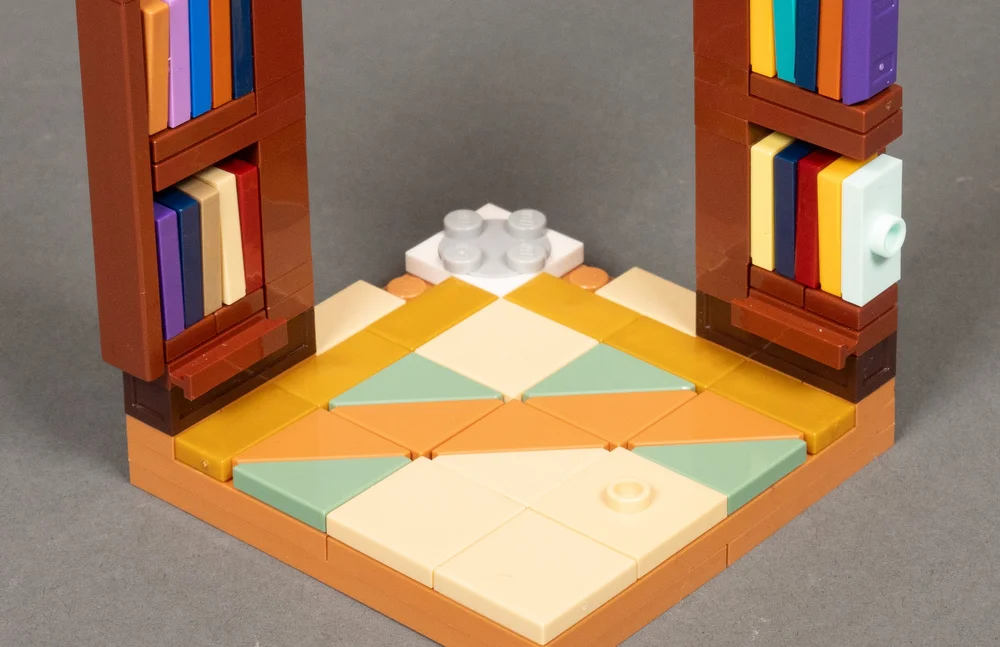
With the turntable in place, I only had the 1x3 studs of space for each bookshelf. I had to get really compact and creative with how I built the shelves. It meant I couldn’t get as varied as I usually like to get with the book designs. The books are mostly all 1x2 jumper plates, slightly jostled to feel just a touch haphazard, and the final jumper on the top and bottom rows allows the brown end tiles to be put in place for a cleaner look. The bottom of the bookshelves are actually 1x3 dark brown wand boxes for a touch of added detail and texture. The whole thing barely worked with such little space. But with some finagling, I finally got a configuration that worked.
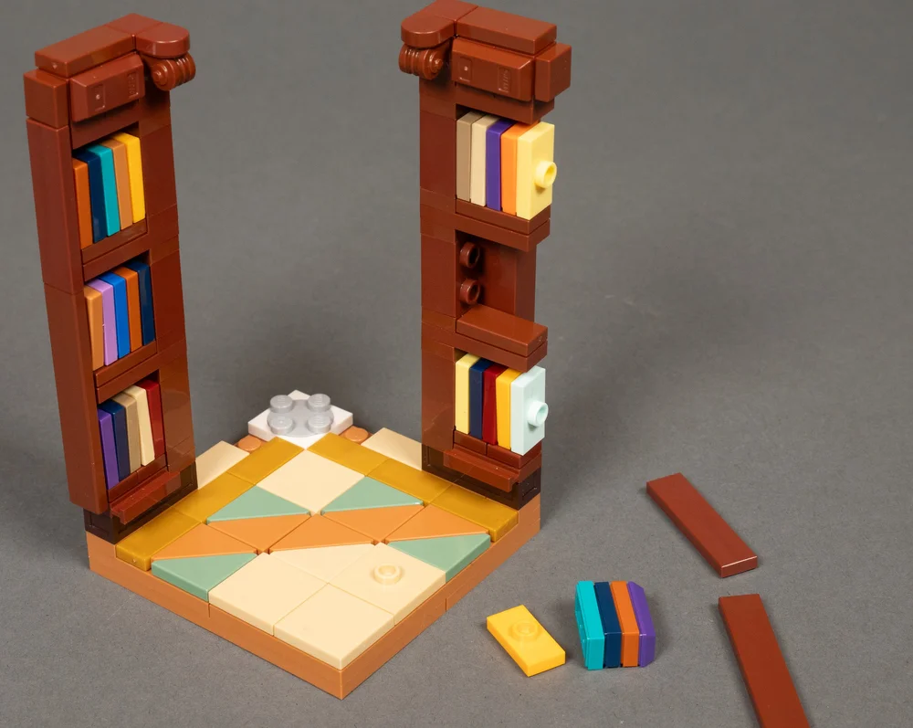
With the floor tiling in place next, Belle brought in, and a book in her hand, we had a completed scene! The book cover from a Disney Wish set was a perfect little reference to the rose. Since it was the top of the habitat stack, it didn’t need the normal platform and studs on top for stacking habitats on it. So I curved the top of the blue wall over the window to add to a more interesting and clean composition.
A Magical Celebration of Disney
While not completely integrated, the habitats come together in a way that threads them together with subtle links between them. With the consistent sky outside the window, one could imagine the habitats represent individual sections of one larger building.
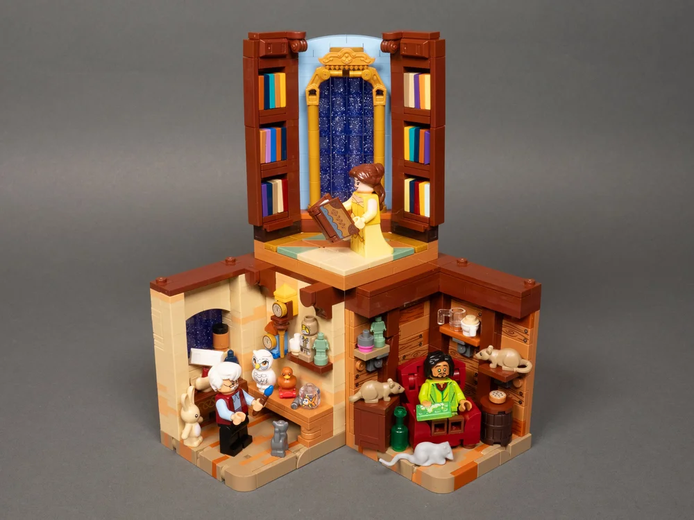
Personally, I was very happy with the minifigures that came with the Magic of Disney. Even though I have qualms with how the set looks as a display piece, it’s a great celebration of Disney throughout the ages, and has exceptional value that I applaud LEGO for making happen.
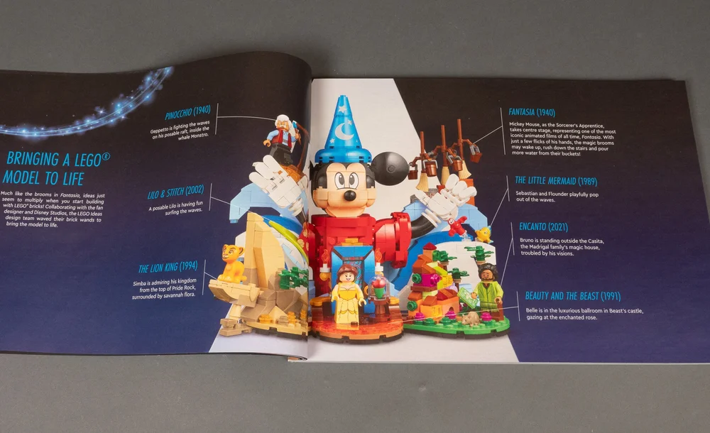
Having more sets accessible for adults without shelling out hundreds of dollars is something I’m heavily in favor of, and I am always happy to see cases like this appear. Bravo, LEGO, and keep this trend of affordable adult sets growing!
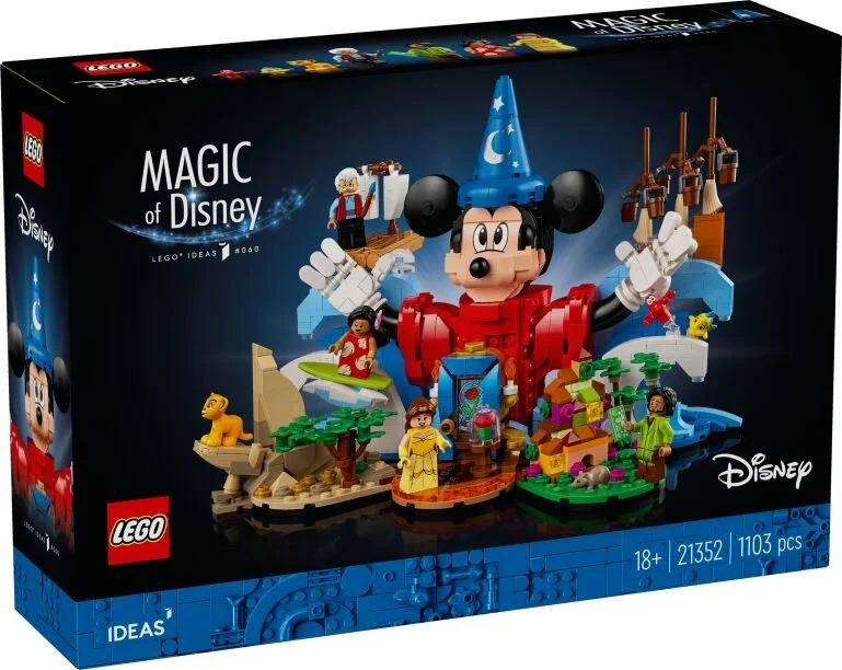
21352 Magic of Disney is now available for around $100 US.
DISCLAIMER: These sets were provided to BrickNerd by The LEGO Group. Any opinions expressed in this article are those of the author.
What other Disney minifigues should LEGO produce? Let us know in the comments below.
Do you want to help BrickNerd continue publishing articles like this one? Become a top patron like Charlie Stephens, Marc & Liz Puleo, Paige Mueller, Rob Klingberg from Brickstuff, John & Joshua Hanlon from Beyond the Brick, Megan Lum, Andy Price, Lukas Kurth from StoneWars, Wayne Tyler, LeAnna Taylor, Monica Innis, Dan Church, and Roxanne Baxter to show your support, get early access, exclusive swag and more.

