LEGO Ideas 21353 The Botanical Garden – Is it everything we’ve hoped for? [Review]
LEGO fans have been begging for a large botanical garden for quite some time. The LEGO Friends 41757 Botanical Garden is immensely popular, and many fans have been buying multiple to create a larger version. It comes as no surprise that fan designer, Valentina Bima, easily achieved the LEGO Ideas support threshold with her lovely submission – and that it was chosen to be a set. LEGO Ideas 21353 The Botanical Garden appears to be a beautiful ode to tradition Victorian glasshouses. But what’s on the inside, and how’s the build experience? Join us as we take a tour!
This 3792-piece set contain 12 minifigures and 9 animals, and LEGO’s in-house set designer, Chris McVeigh, even revealed to us that it includes at least 35 species of plants! It will be available for LEGO Insiders starting November 1st, and everyone else November 4th, retailing for US $329.99 | CAN $429.99 | UK £289.99.
The LEGO Group provided The Brothers Brick with an early copy of this set for review. Providing TBB with products for review guarantees neither coverage nor positive reviews.
Unboxing the parts, instructions, and sticker sheet
The front of the box features the set in its full glory, surrounded by most of the minifigures. It sports a dark tan border in the 18+ style, and a new set-specific logo adorns the top left corner, above LEGO Ideas #061. Meanwhile, the back of the box shows the flip-side of the model, as well as inset images of the interior. Along the left side is a graphic showing how the roof and a couple walls are removable.


Keeping with the trend as of late, the heavy box is lid-style. Inside, bags 12-29 are loose, while a separate box contains bags 1-11, four unnumbered bags, two 32×32-stud baseplates, and the envelope containing the instructions and sticker sheet.


The instruction manual contains information about the fan designer, inspiration for the model, designer notes, a diagram of some of the included species, and other tidbits.


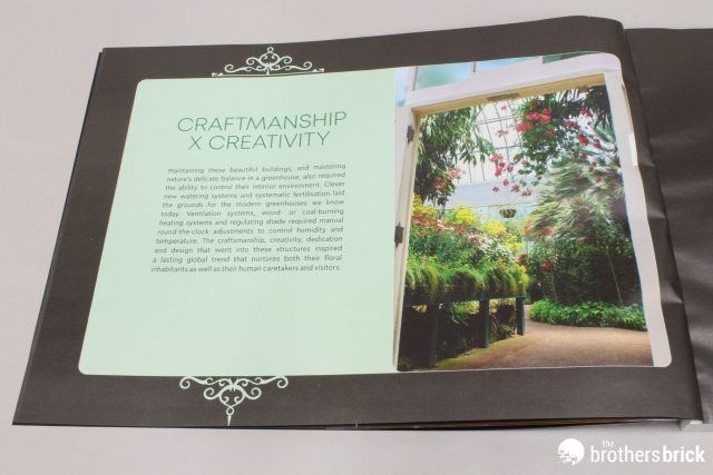


Fortunately, this set contains very few stickers, with just a small sheet.
There are a number of recolors, as well as new element molds and printed elements. The latter two are pictured below. The new molds, which Chris also revealed to us, include a 1×5 white arch piece, a corner clear window panel, and two types of flowers in various colors. Additionally, the fun prints include a beetle, four-leaf clover (of which there are several), and a coffee menu.
The build
The first bag of the set starts us off with a significant base layer of plates and tiles, connecting and spanning across the two baseplates. Immediately, we can see the entire footprint of the model, and where all the walls will go. It’s going to be big!
Next, we start laying down a solid foundation and early walls. At the center of the building there are color-coded holes where the trees will eventually go (one red, one teal). In the front right corner of the foundation, a small green frog in a trans-clear puddle is hidden behind an arch brick. In the back left corner of the glasshouse, a dark bluish grey whip with bar and hole (or Avatar Na’vi neural queue) is used for a watering hose. Near the same area we see the first use of one of the new flower elements for a pair of stray flowers.

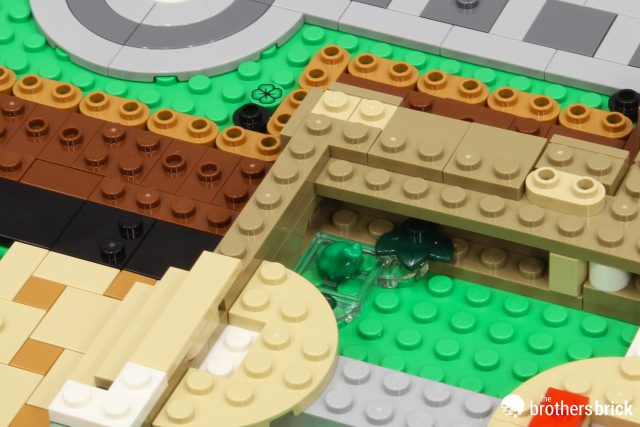
The foundation is capped by a layer of large plates, leaving the tree holes open, yet continuing to reinforce them. All along the edges, dark tan profile bricks flanked by tiles attached via SNOT (Studs Not On Top) bricks begins to provide the architectural ambiance.
With our foundation complete, we add the tiles that comprise the floor, which include sporadic jumpers to attach minifigures. Around the outside edges the base layer for the flower beds are added.
On top of those plates, we then add reddish brown bricks for the dirt. These are boxed in by a lovely border of dark tan regular and curved bricks capped by tan plates and dark tan tiles to give it a clean finish. The holes for the trees continue to get deeper and more supported. Meanwhile, a combination of modified plates and tiles on their sides provide the framework to attach green teeth elements for fern bushes.


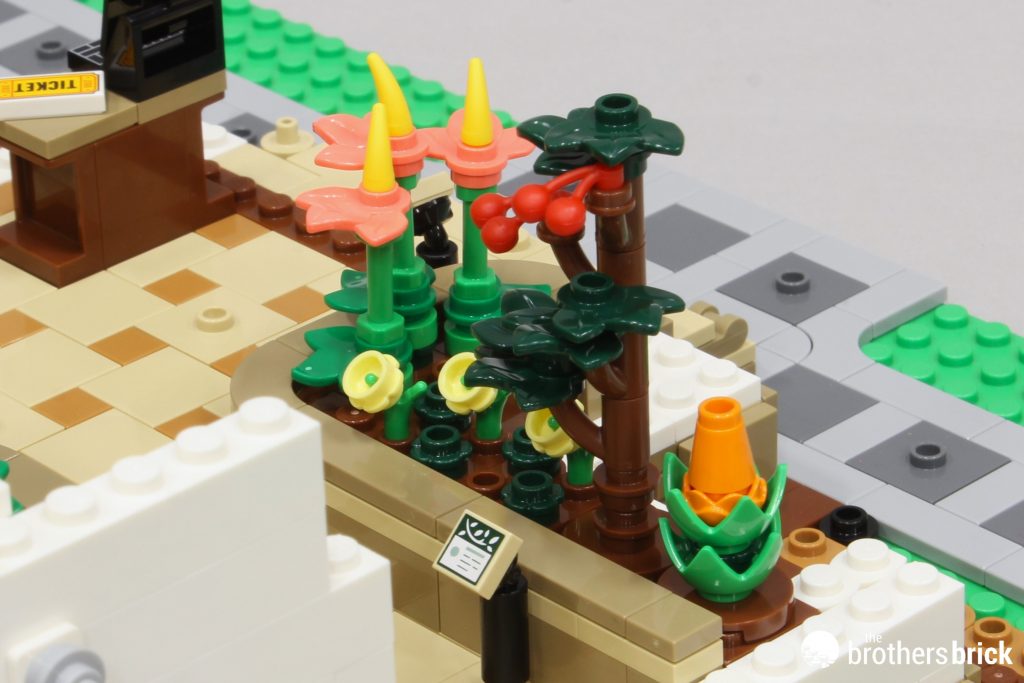
A variety of fun elements are used to make a bunch of plants and fungi to adorn the flowerbeds. This includes pink roller skates, upside-down light yellow crowns, red epaulettes, and lime green broom bristles. Printed 1×1 tiles mounted with black posing elements on candles represent the plaques identifying the plants. (I forgot to picture these new tiles in the “new parts” pic above.) Finally, another frog – this time in olive green – is positioned to hide behind the stairs.
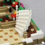
Speaking of stairs, next we switch gears and build the lattice steps. These employ the use of the excellent anti-stud pin as a stopper for the spiral. Clips attach them to a central white rigid hose element, and LEGO geometry gives it just the right height to make that 90° turn to the upper balcony. A white recolor of the pins would’ve been nice, but I’m sure LEGO has a good reason for not doing this.


Our first wall of windows goes up next. Candles mounted using inkwells create columns inspired by Victorian architecture. These are followed by characteristic arches. The wall turns a corner, where we add a light, a railing for the stairs, and a bucket, broom and shovel for the gardeners. Meanwhile, the inside balcony is added with a perfect use of decorative “fence” elements.


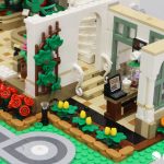
In the opposite diagonal corner, the ticket desk and another flowerbed comes next. Our first sticker is used for the computer screen, alongside a printed 1×2 ticket tile, and another clover is hidden beneath the desk. Minifigure antenna hat elements (new in pink) also make for fun flowers.
On the other side of the entrance, we have another flowerbed, which uses cherries for cocoa beans and another one of those new flowers, this time in orange.
Next, we jump to the right atrium, where we make an espresso machine and a pastry display counter for the café. I’m a fan of the amount of detail packed into a small space, as well as how a tilted shelf is created by using clips attached to a bar in the display case. Also, all of the 1×1 round tiles to represent various items are printed.


After the counters, it’s time to add two of the walls and a door. Simple, yet satisfying plant baskets hang from a bar above some windows. Next to the door is where we mount that printed 2×2 coffee menu tile.
Next, we get some lovely additions to the exterior. This includes bordered flower beds with another color variant of the new flowers. It’s also the first introduction of the new tulip-style element. Other great features include a gate panel used as a vine lattice, and black candles with clear gems used for path lights.
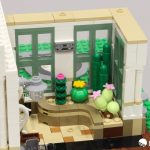
Rotating the model 180°, we jump to the left atrium. Here, more fun pieces create cacti. This includes eggs, a green pumpkin, yet another variant of the new flower piece, and Bionicle eyes paired with Technic connector pieces.
The outside of the left atrium somewhat mirrors the right, but instead of the tulips, we have more new plants. Instead of making them all the same, a green hotdog gives the middle one a unique bend. Here, we also get a white bunny!
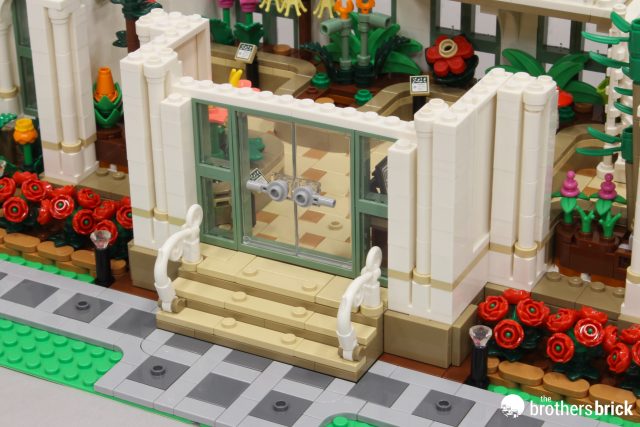
There’s a fair bit of jumping around in the model, which keeps it interesting. Heading back over to the entryway, our largest sticker (roughly 4×4) represents a bulletin board behind the ticket desk. Headphones hang along one wall, likely representing the ones that you sometimes get while visiting museums. It’s at this time that we also add the front double-door, flanked by more windows.
On the outside, walls with more columns surround the door. To this we then add a roof with more windows laid flat. More beautifully done details surround them, including a decorative front consisting of curled white tails, cattle horns, and a unicorn horn. A cool printed bird also sits on top, with lights below and more decorative railings on the stairs. Inside, vines trail along the entrance edges.

Back at the café, a second bird sits on another decorative fence, which contains chairs and a table holding a cupcake. Adjacent to that, another yellow tulip sits in a pot.
At this point, we can stand back and enjoy our progress thus far…
Next, we begin work on our removeable chunks, beginning with a pair of matching walls.
One closes in the café (right atrium), while the other closes in the arid garden (left atrium). Outside and behind the left atrium, we add a couple final touches, with a watering can and a squirrel atop a trashcan.


Finally, we head to the domed roof. The atrium toppers are almost identical, utilizing baby bows and heart tiles to achieve the Victorian look. The difference is the inclusion of another bird nesting on a light in the left atrium.


Our new trans-clear window panels form the dome corners, and they are separated from the plain curved window panels by the new arch pieces. On top, the whole thing is tied together by plates and tiles, which are finished off by 1×1 peaked slopes, and a perfect 2×3 tombstone-shaped tile (new this year).


We’re almost done!


Before the final top goes on, we have to make the trees. First, the eucalyptus tree uses seaweed and upside-down bamboo fronds attached to a randomly-shaped Technic trunk. At its base, a color-coded teal brick signifies the hole it belongs in.


The palm uses Technic bevel gears and a 2×2 round profile brick for the trunk, and versatile leaf elements for the boughs. Like the other tree, a color-coded red brick signifies the designated hole.


Both trees slide in easily and have plenty of support. It’s wonderful that they’re easily removable to see and access the rest of the interior.


The center portion of the removable roof uses the same techniques as the atriums, just on a larger scale, and in two chunks.


A final smattering of various plants decorate the space between the front sidewalks and the edges of the baseplate. It’s amazing how there is ZERO wasted space in this model.


Last, but certainly not least, the front is finished off with a fountain topped with a bird on the right, and a large tree on the left. This is my favorite tree, by far. It’s simply beautiful and unique, utilizing a combination of dark orange leaves (which haven’t been seen in this color for several years) and dark red plant stems. The trunk also has a cool bend in it, formed by an elbow and a dragon tail/horn segment. A tiny beetle (1×1 round printed tile) sits on a lower branch.


And with that, we are FINALLY finished!
The completed model
The finished product is just… Wow! As previously mentioned, there is no wasted space. There are no wasted or meaningless elements. Every inch is utilized in some way, and it’s dense and sturdy without being cluttered. Truly, it’s just gorgeous, from the front…


And the back…


It’s both play and display worthy, and would fit as a centerpiece in any sophisticated city layout.
The minifigures
Oh, and we haven’t even discussed the minifigures, of which there are 12! Like the modular sets, this comes with some fairly generic characters, although, that’s not to say they aren’t special in their own right. Lets take a closer look…
The set contains 4 staff members: two gardeners, the café barista, and the manager. The gardeners wear the same overall uniform, while each sporting their own unique head and hair. For accessories, one carries garden shears (scissors) and the other has a great brick-built leaf blower. The manager has a bag and apparent nametag. The barista wears an apron and beanie, which gives her the perfect urban café look. Three of these character come with alternate faces.


Chris McVeigh also shared some of the relationships between the garden visitors. Let’s start with the first group of four. One pairing consists of an older gentleman with an umbrella and grey hair and a girl wearing headphones (either from the entrance or her own, considering the record on her shirt). Perhaps grandfather and granddaughter. Featured together here but seemingly independent of each other are a blind man with a cane (wand element) and a bearded photographer. The child and blind man both have alternate expressions.


The second set of characters includes two pairs. First, we have another older gentleman with a phone and puppy, and a woman with binoculars. The binoculars are a bit odd, but maybe I’m missing the reference. The final pairing is a boy with a flower and a woman with a purse. It is clear from their alternate expressions that he picked a flower he shouldn’t have and was just scolded by his guardian.


Conclusions and recommendations
As you could probably tell, I’m in love with this set. At every turn I was thoroughly enjoying the build process, and in my opinion, the finished model is exquisite. I can’t express enough how pleased I am that this is a hearty, full model. We recently covered the LEGO X-Mansion, and this set makes that one look like child’s play, hitting (in its own way) everything that set missed. This is a LONG review, because there is simply so much to see. Every single place where it could have simply passed with an A+, it went above and beyond. Things like path lights, numerous animals, and other intricate details set this one above the rest.
Are there any negatives? Well, first, there is a bit of “neutral” aspect. There are a few things that match the original Ideas submission, including the balcony and the general footprint. However, many things stray far from the original design. That said, in my opinion it’s definitely for the better. It took the original idea and greatly enhanced and perfected it – arguably, as an official LEGO set should.
As for the one true negative, we need to take a look at the price. It’s always so easy to be critical of that factor, and perhaps rightly so. Prices continue to climb, making some sets inaccessible for fans. $320 is definitely a huge chunk of change, even if the price-per-piece falls under the desired standard of $0.10. And some people will look at the collection of small tiles and repeated elements and think those things simply hike up the part count. But don’t forget the plethora of interesting pieces in a variety of unique colors, and even multiple new molds. So, is it worth it? From this reviewer, it’s a resounding YES! Save your dollars up and treat yourself to this beautiful set.
LEGO Ideas 21353 The Botanical Garden will be available for LEGO Insiders starting November 1st, retailing for US $329.99 | CAN $429.99 | UK £289.99. You may be able to find it at other retailers on eBay and Amazon.
The LEGO Group provided The Brothers Brick with an early copy of this set for review. Providing TBB with products for review guarantees neither coverage nor positive reviews.






The post LEGO Ideas 21353 The Botanical Garden – Is it everything we’ve hoped for? [Review] appeared first on The Brothers Brick.


